> For the complete documentation index, see [llms.txt](https://docs.marpledata.com/docs/llms.txt). Markdown versions of documentation pages are available by appending `.md` to page URLs; this page is available as [Markdown](https://docs.marpledata.com/docs/marple-insight/user-manuals/analysis/plot-types/scatter.md).
# Scatter
Initially, the scatter plot will be empty.
Drag and drop or double-click signals from the signal list to the x/y or color signal fields to add them to the plot. This is basically the same as you would do with a time series plot (see: [Signal List](/docs/marple-insight/user-manuals/analysis/signal-list.md#add-signals)) .
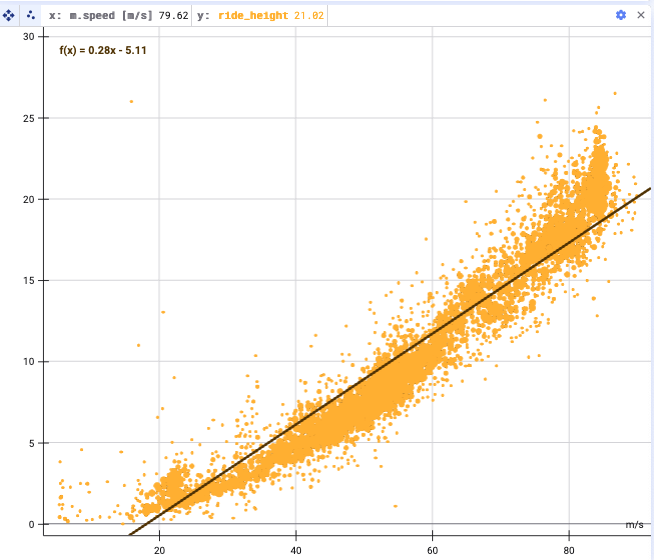
After adding some signals to the scatter plot, the plot should look something like this:
## Settings
When you click on the settings wheel, there are ample options to further configure the scatter plot.
The settings wheel
### **Resample input signals**
You can turn on and off the resampling of the input signals and change the frequency of the resampling. See [Resampling](/docs/marple-insight/user-manuals/analysis/resampling.md) for more details.
### Change axes
You can exchange the X and Y-axes by clicking on the button **cycle through the signals.**
### Alter the limits of the X and Y-axes
Set the **limits** of the X and Y-axes
### Show subsampling grid
You can turn on the display of a **subsampling grid.** This is useful for large datasets, as these are aggregated along a grid.
### Trend line
You can apply a trend line, and choose whether you want the trend line to be linear, quadratic or cubic.
* An example of a quadratic trendline
* A linear trendline
* A cubic trendline
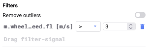
### **Filters**
* **Remove outliers**
* remove data points more than 5 standard deviations away from the mean
* **Filter Signals**
* Add conditions on signals to filter out the data
* You can add multiple filter signals
Filter out outliers
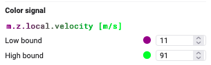
### Add colour signal
Add a colour dimension to the plot by adding a new signal and configuring lower and upper bound colors
### Custom Background
With custom backgrounds you can customize the axes exactly to your needs
* **Upload** a file and **align** the the plot corners so the data fits to the image
* **Lock plot corner** to lock and hide the resize area
### And more!
* **Bullet size/opacity**
* **Show axes/grid lines/axis labels**
* **Show connecting lines**
* Draw a line between subsequent points to follow the trajectory
* Customize the line width and opacity